
Ad-Hoc Charts
Trends or outstanding values are hard to recognize just from looking at numbers. By using charts to visualize the numbers, this information is immediately apparent.
SERAM allows to create ad-hoc charts from the selection of any row, column, column group or even the complete Data Grid. Different chart types allow to visualize different aspects of the data for comparison.
By analyzing the value time frequency, the unit and the structure level, SERAM creates multiple charts where needed to make sure that apples are not compared to oranges, e.g. a site is not compared against a business unit, and a monthly figure is not compared against a yearly value in the chart.
Chart Types
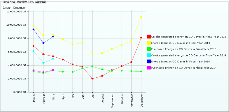
Line charts are most suited for displaying trends, or to complare different indicators over time. When values of multiple periods is to be visualized, SERAM can either render a single line per indicator, or overlay the values of each period as distinct line, thereby allowing to compare the different period's values in the same chart.
Pie charts allow to visualize the percentage of different structures or comparable indicators, such as energy from different sources.
And finally bar charts allow to put comparable indicators side-by-side.
Exporting Charts
By using the print functionality of the browser, the charts can be printed or exported to a PDF file (if supported by the browser or operating system). Since the charts are vector-based, the result remains sharp and doesn't get blurry as bitmap-based charts would.
Related Features:
Feature Categories:
- Verifying or Analyzing Data